ラジオボタンをおしゃれに作る機会がありましたので、備忘録として残しておきます。
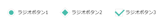
丸型、ひし形、チェック型の3パターン作成しました。
結論
先に、HTMLとCSSのコードを貼っておきます。
このままコピペしていただければ、ある程度使えるかと思います。
inputの属性などは適宜変更してください!
記事の最後に、SCSSで作成した場合のコードも載せてあります。
CodePen
HTML
<div class="container">

 # 丸タイプ
  <label for="radio-1" class="radio-label">
    <input type="radio" id="radio-1" class="radio" name="category_id">
      <span class="label-check round">
        ラジオボタン1
      </span>
  </label>

  # ひし形タイプ
  <label for="radio-2" class="radio-label">
    <input type="radio" id="radio-2" class="radio" name="category_id">
      <span class="label-check square">
        ラジオボタン2
      </span>
  </label>

  # チェックタイプ
  <label for="radio-3" class="radio-label">
    <input type="radio" id="radio-3" class="radio" name="category_id">
      <span class="label-check check">
        ラジオボタン3
      </span>
  </label>

</div>
CSS
# ラジオボタンをラップしている要素
.container {
  display: flex;
  padding: 20px;
  box-sizing: border-box;
}


# 共通スタイル
.radio-label input[type=radio].radio {
  display: none;
}
.radio-label {
  position: relative;
  min-width: 10%;
  margin: 10px;
}
.radio-label .label-check {
  position: relative;
  display: block;
  padding-left: 35px;
  cursor: pointer;
}
.radio-label .label-check:before {
  content: "";
  position: absolute;
  top: 0;
  bottom: 0;
  left: 0;
  display: block;
  margin: auto;
  width: 24px;
  height: 24px;
}
.radio-label input[type=radio].radio:checked + .label-check:after {
  content: "";
  position: absolute;
  top: 0;
  bottom: 0;
  left: 5px;
  display: block;
  margin: auto;
}


# 丸タイプ
.radio-label .label-check.round:before {
  border: 1px solid #ddd;
  border-radius: 40px;
}
.radio-label input[type=radio].radio:checked + .label-check.round:after {
  width: 16px;
  height: 16px;
  background-color: #4abdac;
  border-radius: 40px;
}


# ひし形タイプ
.radio-label .label-check.square:before {
  border: 1px solid #ddd;
  transform: rotate(45deg);
}
.radio-label input[type=radio].radio:checked + .label-check.square:after {
  width: 16px;
  height: 16px;
  background-color: #4abdac;
  transform: rotate(45deg);
}


# チェックタイプ
.radio-label .label-check.check:before {
  border: 1px solid #ddd;
}
.radio-label input[type=radio].radio:checked + .label-check.check:after {
  top: -10px;
  width: 16px;
  height: 24px;
  border-bottom: 5px solid #4abdac;
  border-right: 4px solid #4abdac;
  transform: rotate(45deg);
}
目次
HTML部分
順番にコードを軽く解説してみます。
HTMLに関しては、ほぼ説明することもありませんが・・・
ラジオボタンを囲っている <div class="container"> については、レイアウトのために追加しているだけなので
ラジオボタン自体のスタイルとは関係ありません。
inputの書き方
inputのコードを見てみます。
<label for="radio-1" class="radio-label">
  <input type="radio" id="radio-1" class="radio" name="category_id">
  <span class="label-check round">
    ラジオボタン1
  </span>
</label>
基本ではありますが
inputに付随するテキスト部分 -> 今回は「ラジオボタン1」という部分をクリックした場合にもチェックをつけるために、labelタグで囲うようにしましょう。
labelのforと、inputのidの値を同じになるようにしておきます。
CSS部分
CSSについても軽く解説していきます。
# デフォルトのinputは非表示にしておく
.radio-label input[type=radio].radio {
  display: none;
}
こういったform系のカスタムでは頻出ですが
デフォルトのinputタグはスタイルを調整しづらいので非表示にすることが多いです。
inputタグの共通スタイル
仕組みとしては
labelタグの中にある、spanタグのbefore / after要素でチェックマークの見た目を再現します。
.radio-label .label-check {
  position: relative;
  display: block;
  padding-left: 35px;
  cursor: pointer;
}

# before / after要素で、チェックマークの見た目を作る
.radio-label .label-check:before {
  content: "";
  position: absolute;
  top: 0;
  bottom: 0;
  left: 0;
  display: block;
  margin: auto;
  width: 24px;
  height: 24px;
}

# チェックされた時だけafter要素が表示されるようにする
.radio-label input[type=radio].radio:checked + .label-check:after {
  content: "";
  position: absolute;
  top: 0;
  bottom: 0;
  left: 5px;
  display: block;
  margin: auto;
}
まずは、チェックマークがテキストと上下中央揃えになるように
positionプロパティをabsoluteにし、top、bottomを0、marginをautoにして中央に設定しています。
コードは抜粋して記載していきます。
.radio-label .label-check:before {
  content: "";
  position: absolute;
  top: 0;
  bottom: 0;
  left: 0;
  margin: auto;
}
pxで指定しても問題ないですが、汎用性を考えると、positionで設定した方が便利です。
after要素については、before要素より一回り小さく表示させるので、left: 5px; にしています。
相対値で設定しても良いかもしれません。
.radio-label input[type=radio].radio:checked + .label-check:after {
  content: "";
  position: absolute;
  top: 0;
  bottom: 0;
  left: 5px;
  margin: auto;
}また、after要素はinputがチェックされた時だけ表示されて欲しいのでinput[type=radio]:checked + .label-check:after という様なセレクタになっています。
.radio-label input[type=radio].radio:checked + .label-check:afterinputが:checked の時、+ [要素]:afterで、兄弟要素の:afterを表示、という感じですね。
チェックマークのスタイル
チェックマークのスタイルも見ていきます。
まずは丸タイプから
# 丸タイプ
.radio-label .label-check.round:before {
  border: 1px solid #ddd;
  border-radius: 40px;
}
.radio-label input[type=radio].radio:checked + .label-check.round:after {
  width: 16px;
  height: 16px;
  background-color: #4abdac;
  border-radius: 40px;
}
特に説明することもないですが、border-radiusで円形にしています。
正円なので、radiusの値は50%でもOKです。
次にひし形タイプです。
# ひし形タイプ
.radio-label .label-check.square:before {
  border: 1px solid #ddd;
  transform: rotate(45deg);
}
.radio-label input[type=radio].radio:checked + .label-check.square:after {
  width: 16px;
  height: 16px;
  background-color: #4abdac;
  transform: rotate(45deg);
}
transformプロパティで、正方形を45度傾けています。
最後にチェックタイプです。
# チェックタイプ
.radio-label .label-check.check:before {
  border: 1px solid #ddd;
}
.radio-label input[type=radio].radio:checked + .label-check.check:after {
  top: -10px;
  width: 16px;
  height: 24px;
  border-bottom: 5px solid #4abdac;
  border-right: 4px solid #4abdac;
  transform: rotate(45deg);
}
after要素のborderを、bottomとrightのみ設定し、transformプロパティで、45度傾けることでチェックマークを表現しています。
これだけでもチェックマークにみえますが
入りと抜きの長さを調節してあげると、よりチェックマークらしくなります。
  width: 16px;
  height: 24px;
まとめ
今回はおしゃれなラジオボタンの実装方法を紹介しました。
formタグのカスタムは、styleが複雑になりやすいので大変ではありますが、疑似要素や疑似セレクタを用いてオリジナル性を出せる部分でもあるので、是非おしゃれにカスタマイズしてみてください!
最後に、SCSSで書いた場合のコードも記載しておきます。
# scss
.container {
  display: flex;
  padding: 20px;
  box-sizing: border-box;
}

.radio-label {
  position: relative;
  min-width: 10%;
  margin: 10px;

  .label-check {
    position: relative;
    display: block;
    padding-left: 35px;
    cursor: pointer;

    &:before {
      content: '';
      position: absolute;
      top: 0;
      bottom: 0;
      left: 0;
      display: block;
      margin: auto;
      width: 24px;
      height: 24px;
    }
    &.round {
      &:before {
        border: 1px solid #ddd;
        border-radius: 40px;
      }
    }
    &.square {
      &:before {
        border: 1px solid #ddd;
        transform: rotate(45deg);
      }
    }
    &.check {
      &:before {
        border: 1px solid #ddd;
      }
    }
  }

  input[type="radio"].radio {
    display: none;

    &:checked {
      + .label-check {
        &:after {
          content: '';
          position: absolute;
          top: 0;
          bottom: 0;
          left: 5px;
          display: block;
          margin: auto;
        }
        &.round {
          &:after {
            width: 16px;
            height: 16px;
            background-color: #4abdac;
            border-radius: 40px;
          }
        }
        &.square {
          &:after {
            width: 16px;
            height: 16px;
            background-color: #4abdac;
            transform: rotate(45deg);
          }
        }
        &.check {
          &:after {
            top: -10px;
            width: 16px;
            height: 24px;
            border-bottom: 5px solid #4abdac;
            border-right: 4px solid #4abdac;
            transform: rotate(45deg);
          }
        }
      }
    }
  }
}